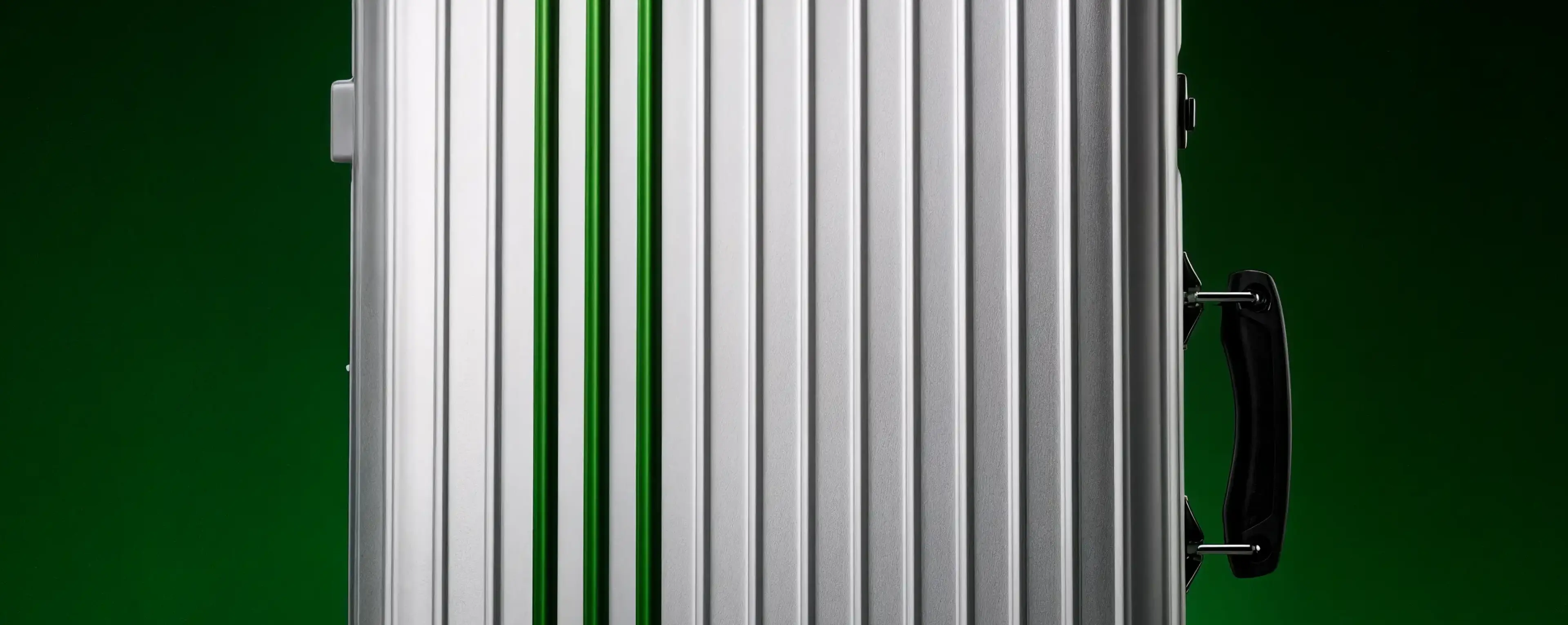
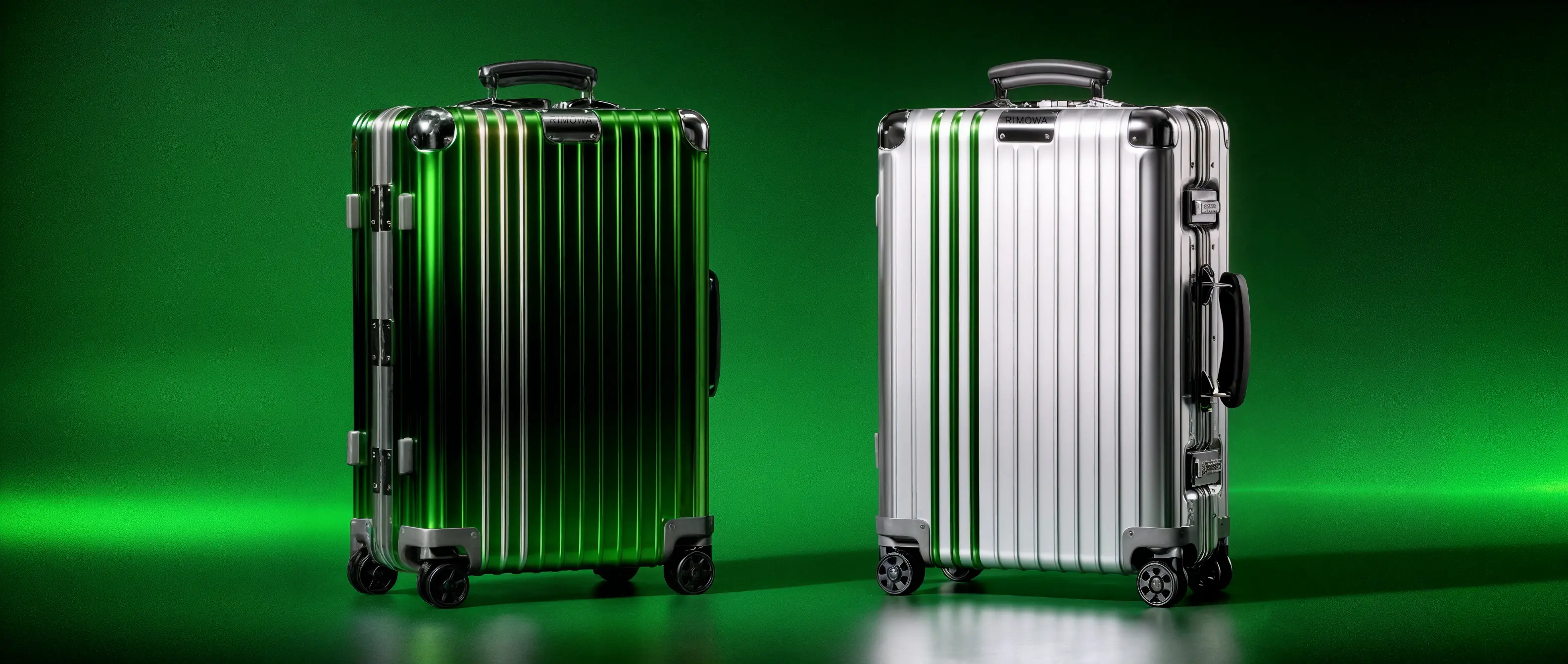
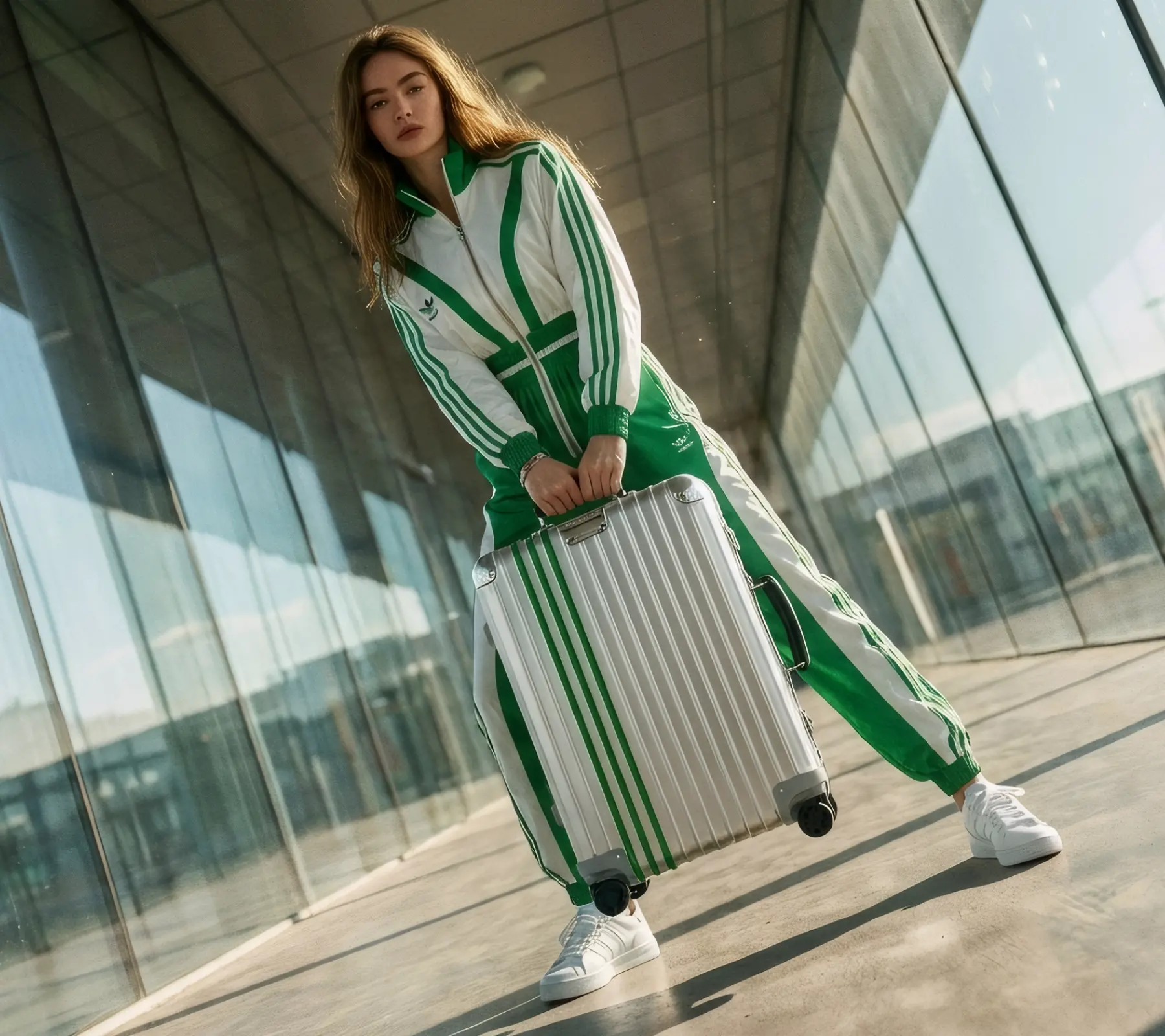
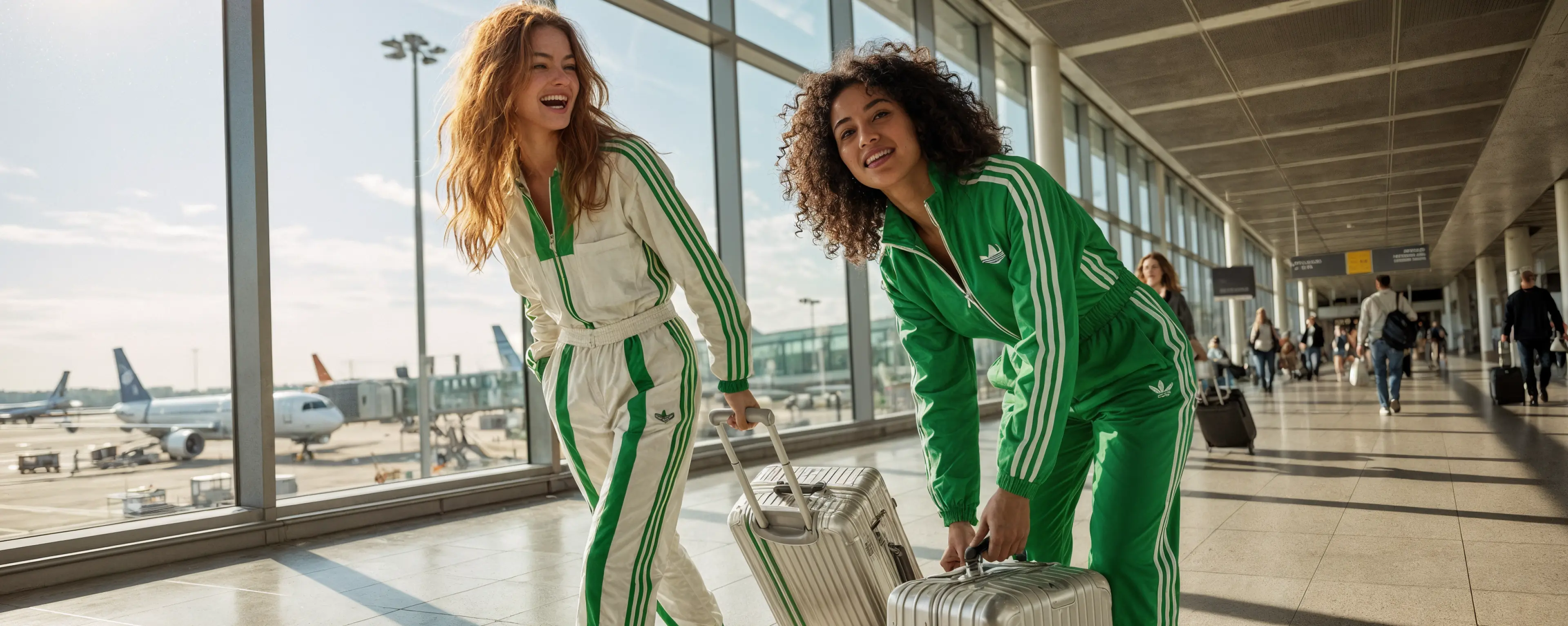
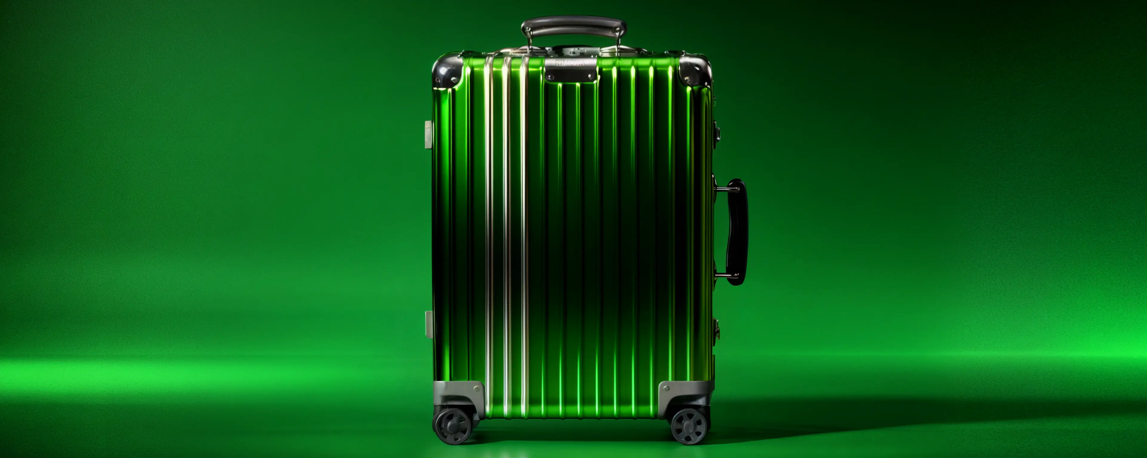
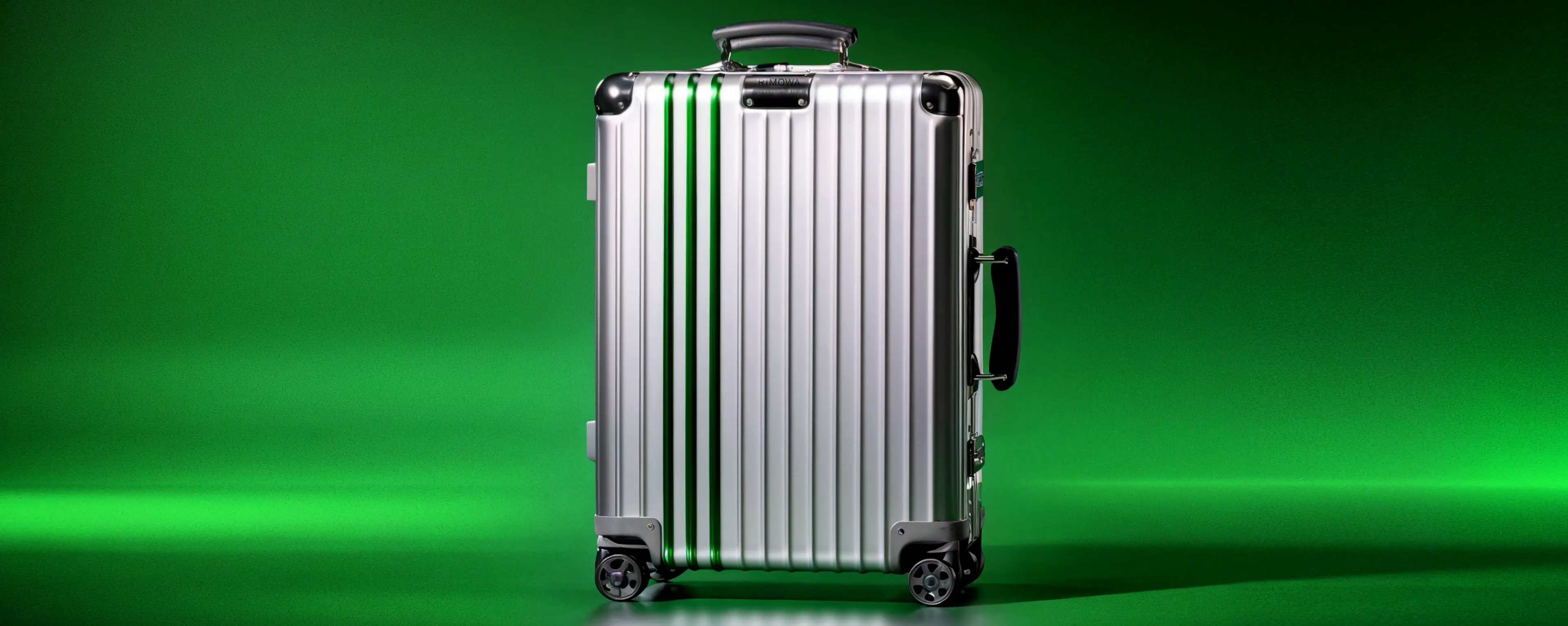
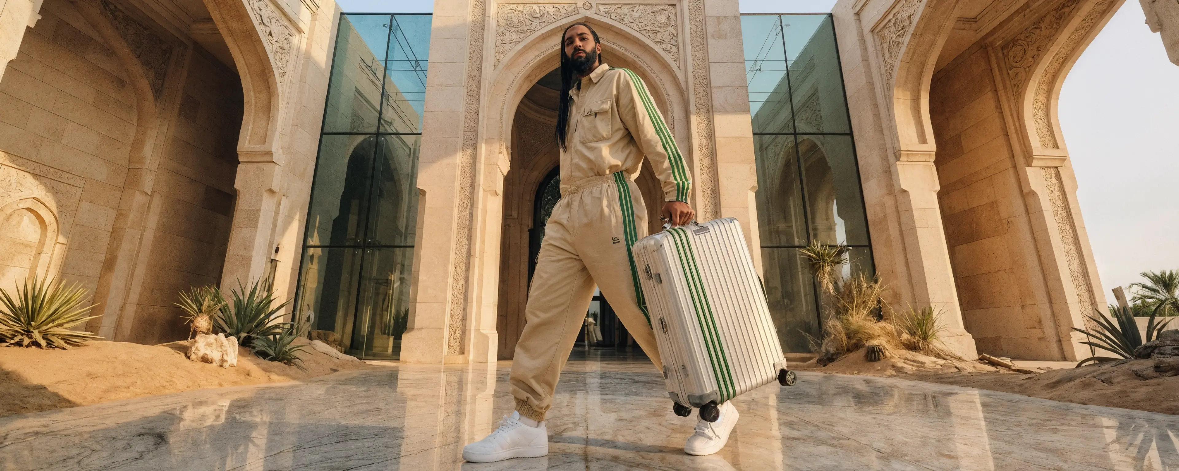
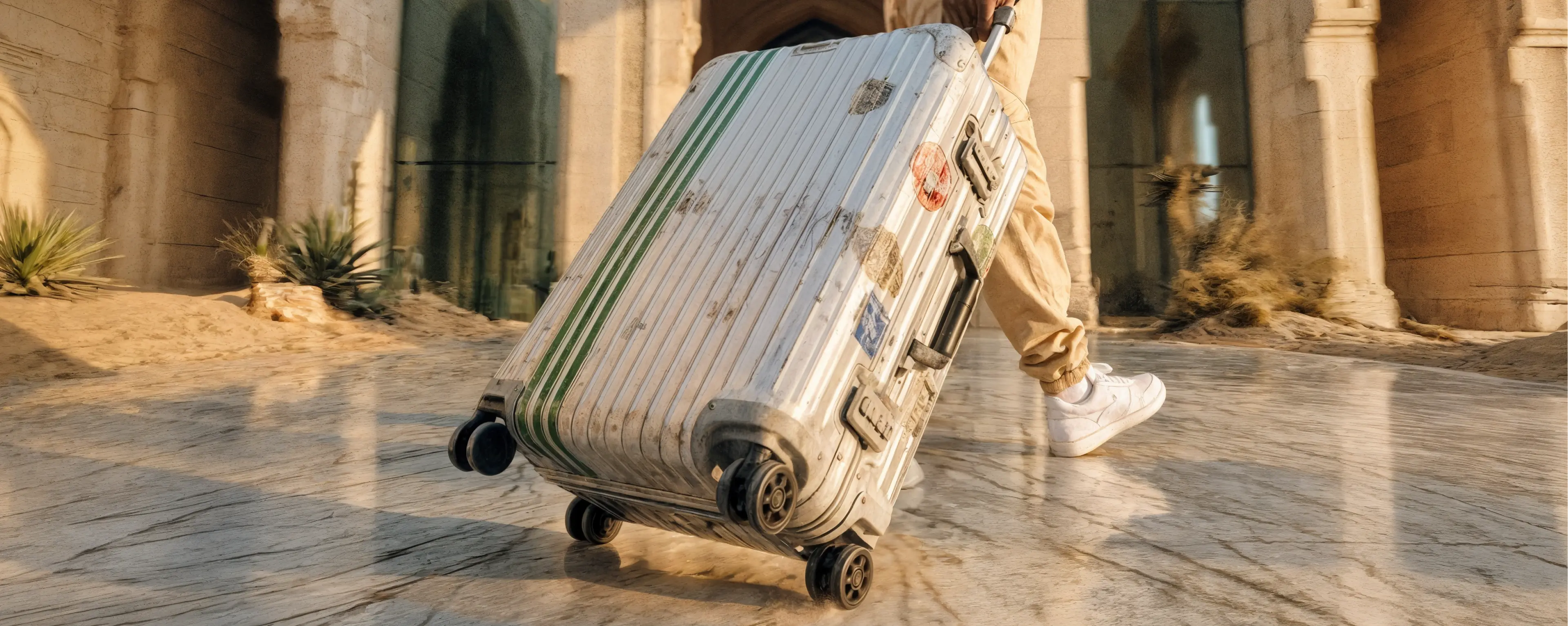
We framed the collaboration under the concept “Lines Built for Motion,” treating both brands’ signatures as a single graphic system rather than separate logos. Stripes and grooves define grids, crops and alignments across all layouts, while typography stays deliberately quiet to let the forms and materials lead. This approach creates a flexible, instantly recognisable language that can live in airports, cityscapes and digital environments without ever losing its luxury, design-led edge.